Hollow Knight: A lesson in Game Design
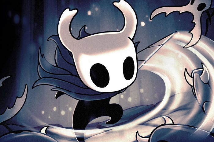
By today, you have probably already played or at least heard about Hollow Knight, an independent game developed through crowdfunding that turned out to be, in my humble opinion, one of the best in its generation. If you have not, let me warn you that this article might contain a few spoilers, so don´t proceed unless willing to face them.
As one of the finest examples of the metroidvania genre, Hollow Knight invites the player to an adventure through a forsaken, decaying, still attractive and majestic world. Anyone brave enough to face the (really) tough bosses, mazes and platforming in the game will be rewarded with a compelling story, revealed on a peacemeal basis by cutscenes, characters and even the backgrounds. And there lies the reason why we should pay close attention to that game: its design. Apart from how you like Hollow Knight or if it speaks to you, it is one of the greatest achievements in Game Design of the last decade. Analyzing some of its aspects can teach a lot about designing video games, as well as alternative ways of telling stories through interaction. That analysis is what I will try to do in the following lines.
This great article, based on an interview with Ari Gibson and William Pellen, a.k.a. Team Cherry, the ingenuous minds behind the game, can shed some light on the process that gave birth to Hollow Knight as we know it. It basically presents the game development sustained by what can be identified as 5 pillars: its main character, its map, its funding, its mechanics (or an aspect of it) and its “editing”, whether for content or platform. But even though knowing those things in bigger depth can help us to understand Hollow Knight a little better, it still misses some very specific points about design: things that make the game not only a commercial hit or critique success, but also a beautifully crafted, extremely well-thought interactive experience.
The art
Visual beauty is even more beautiful if it serves the story you´re telling.
If there is something we should be thankful for, that is the number of beautiful games there are nowadays. And although that “artsy approach” seems to be a trademark when it comes to indie games, mainstream titles are also displaying astonishing views. From the remains of the United States in The Last of Us to the 16-bit with depth of field in Octopath Traveler and back to the vast Hyrule in The Legend of Zelda: Breath of the Wild, art direction plays a big role in rendering worlds (otherwise only accessible individually to their creators) into a publicly accessible (and virtual, one might say) reality. But it can go even further: more than making a game that looks good, the visual choices it comprises might serve as a part of its gameplay. Just like the other points highlighted in this article, this is not something Hollow Knight does exclusively: Breath of the Wild, for example, does an amazing job of using its art and scenery not only as eye candy but also to tell the story and serve as a main part of the gameplay, focused on exploration. That being said, Hollow Knight excels in that direction, making its hand-drawn, extremely detailed art style, one of its most memorable qualities.
While the hand-drawn, strongly outlined characters resemble those of Steamboat Willie or Disney Comics, the soft, smooth backgrounds speak of intertwined vines, pink crystal growing out of rocks, art-nouveau buildings and colorful mushrooms.
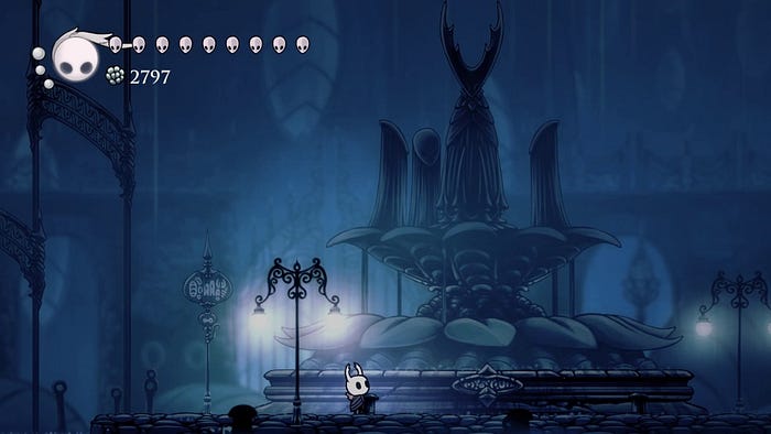
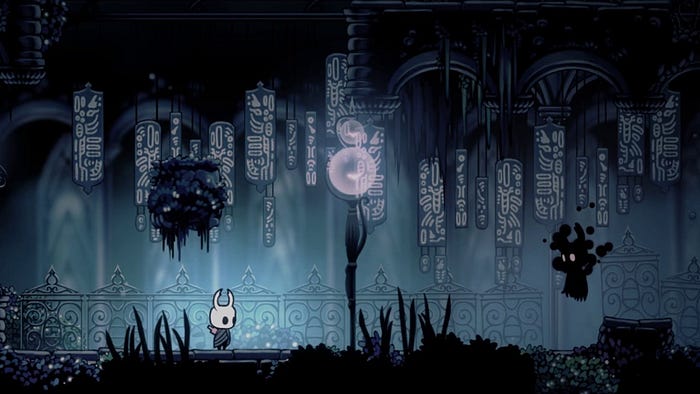
Visually, it mixes references that go from Disney to the Belle Époque. While the hand-drawn, strongly outlined characters resemble those of Steamboat Willie or Disney Comics, the soft, smooth backgrounds speak of intertwined vines, pink crystal growing out of rocks, art-nouveau buildings and colorful mushrooms. It´s impossible not to think of Paris´s saloons while wandering through the City of Tears and its endless, symbolic rain, for instance. The wallpapers, the curtains, the windows, the “perfume bottle shaped” things along the streets all seem to translate a very Baudelairean atmosphere, one in which “the spleen” is almost visible — pretty suitable for a tale about a long-ago faded kingdom. And, more than looking good, this is where the art style triumphs: it is functioning to build an atmosphere. And this is the first lesson we learn from Hollow Knight: visual beauty is even more beautiful if it serves the story you´re telling. The challenge here seemed to be harmonizing the gloomy, dark and dramatic background of the tale with a cute, light and fun look and feel, which lures us to the depths of the game (we will return to that later, when talking about the game mechanics). A hard challenge, but one that was interestingly overcome. That´s why every level looks so perfect. That´s why the game feels so good to look at. Because the art was beautifully thought to “dress” the idea and the atmosphere that Hollow Knight conveys. It may seem like an obvious assumption, but you probably can think of more than one game, good ones, in which, no matter how beautiful or interesting the art is, it is not serving the atmosphere or even competes with it. Kingdom Hearts games, with their colorful, light and playful art style, competing and never harmonizing with their difficult bosses, frustrating challenges and dark, complicated stories are examples of that. The same goes for Final Fantasy XV, a “royal” tale with a darker tone that ends up looking like a Backstreet Boys video.
Form not only follows function, it interlocks with it.

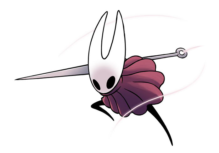
Functionally, it integrates its visual style into the gameplay, using it to give hints, directions or even posing challenges. This article points much of those aspects, like how the benches (save points) or stag stations (fast travel points) are signaled not only in the game map (and that is only if and after the player chooses to do so and pay for it), but also in a diegetic way, using in-game signaling. If art-nouveau signs, with their retorted motifs and pastel colors, are building an atmosphere that looks beautiful, they are also pointing a way through an unknown world. Also, it´s important to note that the map can be enriched with pins you must acquire, as pointed out before, all of them with specific design and color. That confers materiality and agency to the act of mapping, just like the signs do — we´re talking gameplay elements here, not only visual arts anymore. And since the map isn´t complete and you must visit places in order to have them mapped, the in-game signaling is like a light at the end of the tunnel. This, by the way, can also function as signaling: in some dark parts of the game, going for the light might mean reaching a safer point, or one that leads to another area. Light may represent the proximity of a window or exit of the building. Scattered paper sheets along the way signify that a certain character might be near. Orange, gooey blobs, point that the place has been hit by the infection. The gradually changing color scheme indicates that you´re going from one area to another and so on. This all means that in addition to building the atmosphere the game deserves; the art serves as part of its gameplay — which also grows wider with an atmosphere that seduces the players rather than repelling or making them passive. That is the second lesson Hollow Knight teaches us: form not only follows function, it interlocks with it. That seems to be a visual byproduct of what, in my opinion, makes a great game: the interdependence between narrative and gameplay.
The sound
Sound is not a “plus”, it´s a “must”. Make it a part of your interface, not a decoration in it.
Sound editing, sound mixing, and soundtrack play a much bigger role in interactive media than in film. That is due to the fact that once you´re playing a game (or navigating a virtual reality, to cite another example) the truth, timing and appeal of what you hear are decisive to make you feel immersed. If the sound of your steps changes when treading wooden or metal floors, you might start to pay closer attention to where you step. If smashing an enemy sounds as disgusting as it would be in real life, — I´m looking at you, Resident Evil — then you may think twice before engaging in combat, thus building a scary atmosphere.
Hollow Knight knows that and takes it to another level. It starts with the soundtrack, by Cristopher Larkin — hired after crowdfunding turned out better than Team Cherry expected. The orchestral music goes from epic grandeur to intimacy and does that by complimenting what the visual art tells us. In a faded, forsaken town, it sounds sad and gloomy. During boss battles, it goes dramatic, epic, full throttle, with metals and strings. But becomes a mysterious, dissonant, piano motif whenever you have to face your “shade”, after dying. In all those cases, the soundtrack, just like the art, is giving us clues about what to do, where to go, or how to feel. An approach that, from now on, we can assume permeates the whole game. How the soundtrack plays with volume is also interesting: the “shade motif”, for example, will become louder as we come closer to the shade and vice-versa. A brilliant way to guide players through dark, unknown places, even without a map.
Sound editing (meaning the collection and production of sounds) and mixing (meaning what you do with those sounds after collecting them) are also used in that way. And further. You will notice that your steps produce different sounds when walking over surfaces that can be broken down (and open secret passages). The nail sounds different depending on where it hits. And each of those sounds signifies different agencies (like using the dream nail, hitting again to open a passage, or killing an enemy, to cite a few). Sometimes you can hear something like a child cry: it´s a grub in a jar, one of the many we can choose to save along our way. If you don´t see it, but you hear it, that´s a clue that some secret door or passage is somewhere. The same goes for the heavy stomp that indicates the proximity of a big, probably dangerous and annoying foe. Or the cheerful humming and singing of some characters, indicating that you might be close to uncovering one more hint of the mysterious game lore. The third lesson brought by Hollow Knight is a really simple one, especially for contemporary games, but one that is surprisingly underused: sound is not a “plus”, it´s a “must”. Make it a part of your interface, not a decoration in it. The result is much more immersive and emotional. And that is why this lesson was well learned by game devs who work with horror: Resident Evil 7, Amnesia and Alien: Isolation all stand out for their sound design.
The mechanics
And now we reach the core of what makes Hollow Knight such a good example of Game Design: its mechanics. The visuals and the sounds are serving and reflecting a system of usability that provides an impeccable gaming experience, one aimed at and around a central figure: the player.
Firstly, the mechanics are based on choices. The game might be linear — or as linear as a Metroidvania can get -, objectives and quests might be clear, but players can still choose when and how they are going to do what they want. And those choices always result in how much of the lore they uncover, how much geo (in-game currency) they earn, which power-ups and upgrades they will get, or how hard the journey will be. It feels like an open-world adventure, even if it´s not really one. Metroid and Castlevania have done that before, of course. Mario Odyssey has a dash of it. But the limits are much broader in Hollow Knight, and that deserves closer attention.
Game design should focus on players, allowing them to make choices and creating their own experiences.
The charm system: From early in the game you will find out that you can buy, collect and use charms. As with everything else here, they don´t just look good. They grant the character passive abilities that are important to face some challenges. Focus on “some”. The trick here is that those charms have a cost to be equipped: 1 to 3 notches, for example. And the number of notches available is limited (you start with five and can buy or find more along the way. Spoiler: they´re expensive and rare). Which leads to a choice: what charm combination to wear for each occasion? — you might find that choosing your outfit for parties and family dinners is much easier. Some bosses with really quick attacks, leaving no time to heal might make you want charms that increase your HP. Exploring a large, unmapped area, might lead you to choose navigational and mobility charms. And a boss that has a longer “cool down” after a powerful attack might encourage you to equip charms that allow you to heal faster or cast spells more frequently. From carapace shields to gaining “soul” (energy used for healing and casting spells) when damage is dealt to you or to others, there is a charm for almost every situation. Collecting and combining them is up to the player. And there is not a “sure to win” charm build — “every choice comes with a consequence”. Adapt if you want to survive.

Level design and Navigation: Metroidvanias, by definition, are games that lead the player to level exploration and backtracking. But, since Adventure — yes, that “primitive” game that some of the younger players might only know through “Ready Player 1” — we all know that there is always a risk to fall into that room we can´t leave anymore. Or accessing that secret place where enemies are so powerful you can´t beat them. Usually, those situations mean instant death, but since saving became a common functionality in games, and some of them will autosave, there is always the frightening, terrible danger of finding yourself trapped in a situation you simply can´t get out of. And then you must start the game all over again (or at least from an old save). That happened to me in Fallout 4 and thanks to one of those infamous Bethesda bugs (romantic irony), I could get out.

That is not something to worry about in Hollow Knight. The game is designed in a way that even if you access a level too early (or too late), it will be adequate for the skills at your disposal. And this is my favorite thing about this game: how the devs designed it in a way that no matter what your power-ups are, what upgrades you have, or how far you´ve gone in the story, levels will always feel fresh and pose challenges, rewards, and lore that are satisfactory to the player, as well as a way in and a way out. Of course: if you have just acquired the desolate dive and used it to access, let´s say, Crystal Peak, which you remembered from the beginning of the game, you better be up for a really bumpy ride (I regret that every day). That area was intended to be fully accessed further on and most of the places will be inaccessible without a lantern or double-jump. In fact, you might feel trapped forever and, looking up some internet forums, I saw people recommending the use of an old save or just restarting the game. There was even a guy who wrote: “this is the perfect example of terrible level design”. And it would be… if there wasn´t a way out. Not only there is, but it also comes with a power-up that, besides functioning like a cutscene after such an ordeal, will also give you access to new areas. It demanded more exploration, more patience, a lot of platforming, and resilience as big as my dare to enter a place I knew it wasn´t time to visit… but just like that, the reward was so big that almost got me crying. Or maybe it actually did.
This amplitude of navigation through the game is possible because the design takes choices into account. It knows that players´ decision to explore can be influenced, but not determined by the script, and that no matter where they decide to go, if they can get in, there must be a way out. Considering that what determines the capacity to access or leave areas are power-ups (special abilities acquired after some bosses or platforming gauntlets), the level design had to take into account with surgical precision:
· Where each power-up would be located and what abilities and power-ups are needed to access each of those places.
· “Levels of access” had to be thought for each area: where should the player be able to go with no power-ups? And with one? And with all of them? How many ways out (and in) are available for each of those levels? What kind of foes would be in each level? Or, if they wanted the area to be really complex and difficult, the very access to the area should be limited by a power-up that could only be collected in the late game. This leads to the fact that this second topic is related to the first. And complexifies the flow diagram of the game mechanics.
· Difficulty levels in each of the “levels of access”, in a way that the game would never feel too easy or too hard.
· Area modification according to game progression. That comes as a consequence of the previous topic: since some areas are accessed over and over from the first moments of the game and they serve as “hubs”, connecting to almost every other area, the only way of equalizing them with the rest is using lore (a wise trick!) to modify them and make them harder (and more interesting) during the entirety of the game.
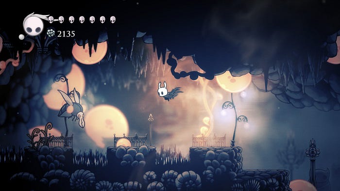
Charm system, level design and navigation together sum up the fourth and, in my opinion, the most important lesson we learn from Hollow Knight: game design should focus on players, allowing them to make choices and creating their own experiences. Design can, of course, be used to circumscribe those experiences to the universe or time you want. Hollow Knight does it very well, using all the aforementioned techniques and some to be discussed further on. But when design prevents the players from crafting or tailoring their experience, it is also harming interactivity, impacting most people in the same way. Of course: that can be the objective: it happens mostly when the narrative is the focus and you want everyone to reach the same conclusions and emotions at the same time — as most movies do. But then, the “gaming” aspect of your work is thrown away, losing the chance to provide experiences only video games can. And again, we´re talking about interlocking narrative and gameplay. Not by chance, open world and online games — all of them highly subject to player interaction and non-linear experiences — are springing everywhere: they´re the easiest way of achieving that “nirvana” of interaction (even if most of them refrain from narrative, which also unbalances the equation). But Hollow Knight is here to show that smart design can bring that level of agency and interaction even to linear, Metroidvania games, which is a considerable achievement.
Your game should be as difficult as your rewards are great.
Punishment and reward balance: Ok, I hear you, Hollow Knight can excel in design and be really interesting, but let´s talk about how tough it is and how frustrating that might be. If compared to average games, especially the “cinematic” ones we have become used to nowadays, it is difficult. But if you grew up playing Mario or if you ever played any entry in the Donkey Kong franchise, you are prepared for Hollow Knight. It has some challenging parts, a few bosses may get you stuck for a week (or more) and part of the platforming can make you throw your controller in dangerous ways. Still, none of it happens randomly or for no reason (remember how the art signaled this combination of dark and cute?). As with everything else, the difficulty comes by design, and this is a relief.
In short terms, Hollow Knight bases its difficulty on a balance much older than video games: that between reward and punishment. It means that going through a specially tough part or boss will result in a specially good item/power-up/plot point. And since, as mentioned before, better power-ups are only accessible later in the game, the difficulty curve grows ever more smoothly and proportionally to the players learning and abilities. In other words: it never gives you more than you can handle — although sometimes it may not look like that. Part of the fun will be finding out that, yes, you can beat that boss, even if it looked impossible before going back and finding that charm/power-up. And that is why it was so punishing: so that the player would have to go back and get a reward — which leads to another.
The same goes for the “dying” system. Just like in the Soul Series (definitely not a good example of punishment/reward balance), you lose all your money upon dying. To recollect it, you must go to the place where you fell to enemies and kill your “shade”, the ghost you left behind. That means that dying brings a punishment: which is going back to the last save point, going all the way again (sometimes that way is a really long one) and getting there alive, so you can kill the shade and reclaim what was yours. But it also brings a reward: if the region where you died wasn´t mapped, it will be on the second time, making navigation easier. You will know the enemies on the way. And you can kill them again, getting more geo. That means dying is also a way to get rich: some of my wealthiest moments in the game were just after defeating the hardest bosses. It is also true that I´ve lost all the money moments later because I was greedy for the new open area and haven´t thought of going back and saving, but hey… punishment and reward again. All shaped by the player´s decision. This brings the fifth lesson: your game should be as difficult as your rewards are great. Players won´t get (much) frustrated and stop playing if they expect a really good thing to happen next. And (that´s basic feedback working) if they feel rewarded and satisfied with what they´re seeing, they will also be willing to face more challenges to get to explore it a little more.
The lore
If interaction is your goal, don´t tell the story. Give clues so the player can assemble it.
Finally, the lore. Revealing its details here is also ruining the experience if you haven´t played, but it can´t be ignored as an important piece in the intricate design puzzle we are analyzing – the thread that brings all those beautiful parts together and render them into a single piece. And to keep it simple, Hollow Knight´s plot is, basically, open. There is a story. There is a lot to uncover. And a lot to see. But the player´s involvement with it is directly related to their involvement in gameplay. The story is revealed through dialogue lines gotten by following characters in not-so-intuitive ways. Ancient monuments and graves have pieces of lore engraved in it. Naming plays a big role as well, and sometimes the name of a place fills it with a backstory. The “Hunter´s Journal”, a catalog with every enemy in the game, explains what the foes are (or were). And information grows depending on how many of each type you have killed. The list goes on and on, but the point is: the narrative is tied to the gameplay and exploration. There will not be a cutscene that explains everything nor a text that summarizes the past. Just like in games such as Firewatch, Gone Home or Jouney (curiously, indie games seem to be more open to indetermination than mainstream ones), you want the lore, you must go and get it. And that also makes them a lot more worthwhile. Since dialogues are so rare and short, not even anxious players will want to skip them, as they might contain the answer to what just happened. Since cutscenes can be counted on the fingers of one hand, each of them comes as a big, exhilarating reward that no one wants to waste. You can end the game knowing only the synopsis (that you are an insectoid wraith warrior wandering through a faded kingdom) and be content with it, or you can find every secret tale and detail of why you´re there, who you are and what has happened.

And if complexity and depth of lore comes “on demand”, it never exceeds the limit of the comprehensible. No Kingdom Hearts mess or Witcher´s continuity to interfere in the experience. Just a clear, simple tale with a dark undertone. That can be enriched with the DLCs, by the way.
So the last lesson is: if interaction is your goal, don´t tell the story. Give clues so the player can assemble it. Something that even cinema has grabbed, but games, especially mainstream games, still fail to capture.
It doesn´t matter how much you appreciate or enjoy the game. As a piece of design, Hollow Knight stands out as something we should pursuit. Not only as players, developers or designers, but as anyone who believes in interactivity as a way of conveying emotions, actions and ideas. Just like it assembles principles from many sources to achieve a fresh, remarkable standard, we are now able to use its legacy to go even further. And just like the main character, do what, in the first moments, looked impossible.
